matplot绘图
发布时间:2020-12-20 10:15:37 所属栏目:Python 来源:网络整理
导读:Matplotlib Matplotlib 是一个 Python 的 2D绘图库,通过 Matplotlib,开发者可以仅需要几行代码,便可以生成绘图,直方图,功率谱,条形图,错误图,散点图等。 http://matplotlib.org 用于创建出版质量图表的绘图工具库 目的是为Python构建一个Matlab式的
|
Matplotlib
Matplotlib 是一个 Python 的 2D绘图库,通过 Matplotlib,开发者可以仅需要几行代码,便可以生成绘图,直方图,功率谱,条形图,错误图,散点图等。http://matplotlib.org
figure
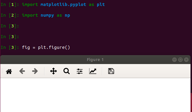
示例代码: # 引入matplotlib包 import matplotlib.pyplot as plt import numpy as np %matplotlib inline #在jupyter notebook 里需要使用这一句命令 # 创建figure对象 fig = plt.figure() 运行结果:会弹出一个figure窗口,如下图所示
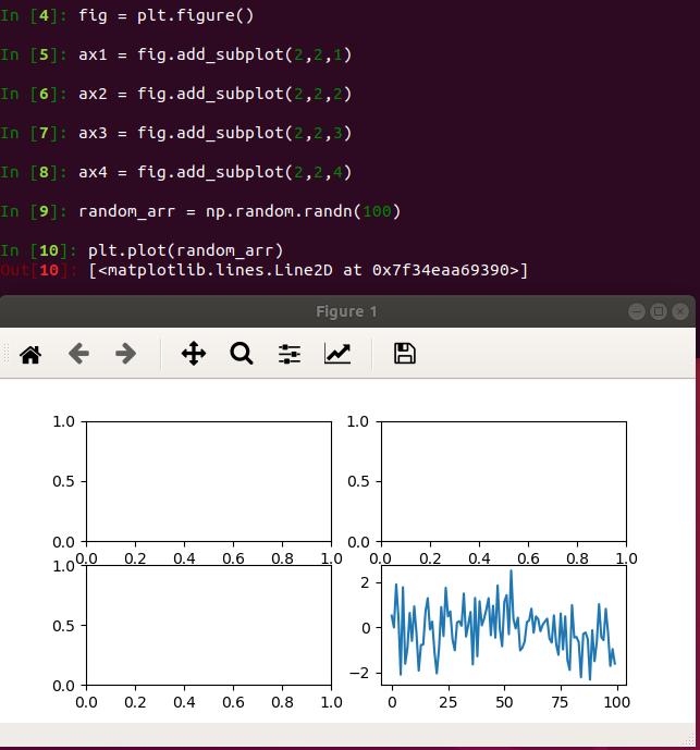
subplotfig.add_subplot(a,b,c)
示例代码: # 指定切分区域的位置 ax1 = fig.add_subplot(2,2,1) ax2 = fig.add_subplot(2,2) ax3 = fig.add_subplot(2,3) ax4 = fig.add_subplot(2,4) # 在subplot上作图 random_arr = np.random.randn(100) #print random_arr # 默认是在最后一次使用subplot的位置上作图,但是在jupyter notebook 里可能显示有误 plt.plot(random_arr) # 可以指定在某个或多个subplot位置上作图 # ax1 = fig.plot(random_arr) # ax2 = fig.plot(random_arr) # ax3 = fig.plot(random_arr) # 显示绘图结果 plt.show() 运行结果:仅右下角有图
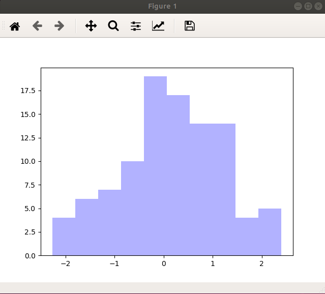
直方图:hist示例代码: import matplotlib.pyplot as plt import numpy as np plt.hist(np.random.randn(100),bins=10,color=‘b‘,alpha=0.3) plt.show()
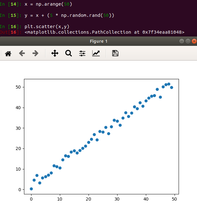
散点图:scatter示例代码: import matplotlib.pyplot as plt import numpy as np # 绘制散点图 x = np.arange(50) y = x + 5 * np.random.rand(50) plt.scatter(x,y) plt.show()
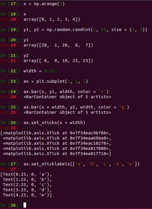
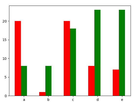
柱状图:bar示例代码: import matplotlib.pyplot as plt import numpy as np # 柱状图 x = np.arange(5) y1,y2 = np.random.randint(1,25,size=(2,5)) width = 0.25 ax = plt.subplot(1,1,1) ax.bar(x,y1,width,color=‘r‘) ax.bar(x+width,y2,color=‘g‘) ax.set_xticks(x+width) ax.set_xticklabels([‘a‘,‘b‘,‘c‘,‘d‘,‘e‘]) plt.show()
矩阵绘图:plt.imshow()
示例代码: import matplotlib.pyplot as plt import numpy as np # 矩阵绘图 m = np.random.rand(10,10) print(m) plt.imshow(m,interpolation=‘nearest‘,cmap=plt.cm.ocean) plt.colorbar() plt.show() plt.subplots()
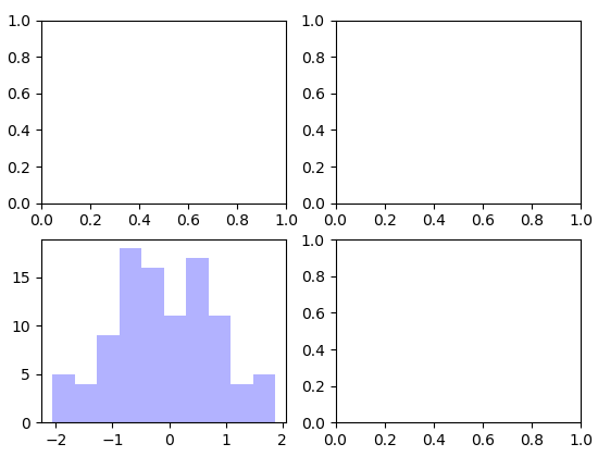
示例代码: import matplotlib.pyplot as plt import numpy as np fig,2) # bins 为显示个数,一般小于等于数值个数 subplot_arr[1,0].hist(np.random.randn(100),alpha=0.3) plt.show() 运行结果:左下角绘图
颜色、标记、线型
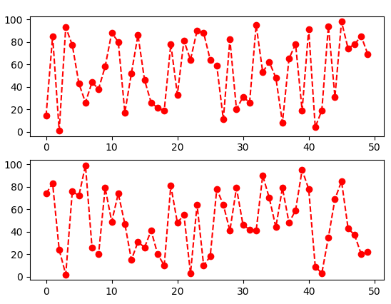
示例代码: import matplotlib.pyplot as plt import numpy as np fig,axes = plt.subplots(2) axes[0].plot(np.random.randint(0,100,50),‘ro--‘) # 等价 axes[1].plot(np.random.randint(0,color=‘r‘,linestyle=‘dashed‘,marker=‘o‘)
标记
线型
刻度、标签、图例
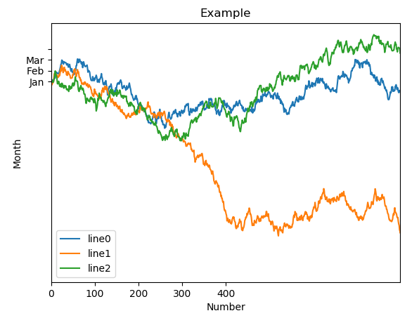
示例代码: import matplotlib.pyplot as plt import numpy as np fig,ax = plt.subplots(1) ax.plot(np.random.randn(1000).cumsum(),label=‘line0‘) # 设置刻度 #plt.xlim([0,500]) ax.set_xlim([0,800]) # 设置显示的刻度 #plt.xticks([0,500]) ax.set_xticks(range(0,500,100)) # 设置刻度标签 ax.set_yticklabels([‘Jan‘,‘Feb‘,‘Mar‘]) # 设置坐标轴标签 ax.set_xlabel(‘Number‘) ax.set_ylabel(‘Month‘) # 设置标题 ax.set_title(‘Example‘) # 图例 ax.plot(np.random.randn(1000).cumsum(),label=‘line1‘) ax.plot(np.random.randn(1000).cumsum(),label=‘line2‘) ax.legend() ax.legend(loc=‘best‘) #plt.legend()
(编辑:李大同) 【声明】本站内容均来自网络,其相关言论仅代表作者个人观点,不代表本站立场。若无意侵犯到您的权利,请及时与联系站长删除相关内容! |